Tag Archives: coronavirus

International Lockdown Effectiveness - Part 2

I last wrote about lockdown effectiveness (or lack thereof) back in April 2020. In the same way, I'm once again thinking about virus stats instead of studying... ?

So after all this time, how do country's cases and deaths compare? Let's have a look shall we? I've picked out six countries that have been in the UK news a lot recently.

Here's the number of cases in each country as a percentage of the population. As before, populations are approximate. In order of severity:

CountryPopulation (millions)Cases% of population
USA330.6421,761,1866.58%
UK67.822,957,4764.36%
France65.252,701,6584.14%
Brazil213.348,013,7083.76%
South Africa59.31,192,5702.01%
NZ51,8630.04%

Here is the percentage of each population dead due to covid-19:

CountryPopulation (millions)Deaths% of population
UK67.8279,8330.12%
USA330.64365,8860.11%
France65.2567,0490.1%
Brazil213.34201,4600.09%
South Africa59.332,4250.05%
NZ5250.0005%

Why is there such a high chance of death in the UK compared to anywhere else? Again, why is this not being reported on? ?‍♂️

Resources:
https://covid19.who.int/

International Lockdown Effectiveness

"How effective is each country's lockdown strategy?"

Once again, I'm thinking about covid-19 statistics rather than doing any actual statistics homework...

There are suddenly a lot of very large numbers flying around, and a lot of graphs saying "country A" is worse off than that "country B". -though none of them have appeared clear to me. Some of them try to compare too much, and others specifically attack "country A" for "reasons".

So I decided to take a snapshot of several countries from today, April 23rd 2020, to try and paint a more accurate picture of where we currently are. Adjust the populations below as you see fit, but they're more or less accurate. I just wanted to get a general idea.

First off, the UK. Currently 133,495 infected, population 67.82 million. That's 0.2% of the population infected.

Looking at just England's stats (99,137 infected) I thought damn, the English are doing really badly here. That's 99,137 of the total 133,495 in the whole of the UK! But then I compared all the countries in the UK together... Check this out:

Country Infected Population (million) Percentage of Population infected
UK 133495 67.82 0.20%
England 99137 55.98 0.18%
Scotland 9038 5.45 0.17%
Wales 8124 3.136 0.26%
Northern Ireland 2874 1.88 0.15%


No joke. England actually has 0.18% infected, while Wales has shot ahead with 0.26%.

So that got me thinking further... what about Europe? Germany's doing really badly in the UK's press at the moment...

Country Infected Population (million) Percentage of Population infected
UK 133495 67.82 0.20%
France 119151 65.25 0.18%
Germany 148046 83.73 0.18%
Italy 187327 60.48 0.31%


Oh.

Well America's always in the news at the moment! Trump's screwing that country, right?

Country Infected Population (million) Percentage of Population infected
United States 800926 330.64 0.24%
Washington State 12494 7.62 0.16%
California State 35396 39.51 0.09%
New York State 258589 19.45 1.33%


Oh. Right, I guess we're not that far behind them.

Wait, can we even talk about how "The United States" is doing? I don't think so, not when you have California at 0.09% and New York at 1.33%. Rather than "Trump and America", we should probably be talking about "State Governor and State".

Well New Zealand is doing very well, right? Press is practically hailing Prime Minster Ardern as a hero.

Country Infected Population (million) Percentage of Population infected
New Zealand 1112 4.89 0.02%


Okay, I suppose this is kind of what we expected.

So how's China at the moment? They've been the benchmark this entire time.

Country Infected Population (million) Percentage of Population infected
China 84302 1433.78 0.01%


Wow, what?

I found all this eye-opening. Here's all of them together in percentage order:

Country Infected Population (million) Percentage of Population infected
China 84302 1433.78 0.01%
New Zealand 1112 4.89 0.02%
California State 35396 39.51 0.09%
Northern Ireland 2874 1.88 0.15%
Washington State 12494 7.62 0.16%
Scotland 9038 5.45 0.17%
Germany 148046 83.73 0.18%
England 99137 55.98 0.18%
France 119151 65.25 0.18%
UK 133495 67.82 0.20%
United States 800926 330.64 0.24%
Wales 8124 3.136 0.26%
Italy 187327 60.48 0.31%
New York State 258589 19.45 1.33%


This showed me that as members of the public, we don't really have the whole statistical picture at the moment. But this only begins to look at lockdown effectiveness. How is actual healthcare working in each country, what are the percentage of deaths in each country?

What are the percentages of infectives and deaths in each country over time? How can we compare effectiveness of strategy?

Why isn't any of this being reported?
[UPDATE as of May 27th, 2020. Now they're reporting it... Godamn.]


Resources:

https://who.maps.arcgis.com/apps/opsdashboard/index.html#/ead3c6475654481ca51c248d52ab9c61
https://covid19.who.int/
https://nymag.com/intelligencer/article/new-york-coronavirus-cases-updates.html
https://www.doh.wa.gov/emergencies/coronavirus
https://www.worldometers.info/population/world/


Covid-19 Coronavirus

So this virus outbreak thing is interesting isn't it?

As a mathematician-in-training, what I'm finding more interesting is the lack of good statistics on what's happening. The UK government were initially publishing new infections within England and in the whole of the UK. In addition, they were publishing the total UK infected, and total UK deaths. They stopped reporting anything on March 5th.

Though as well as keeping track of government announcements, I've also been keeping record of daily updates that the World Health Organisation (WHO) have been making.

Here's a link to their European map.

Here's a link to their global map.

On a daily basis, I've been recording UK totals from their site. You can see them graphed below:

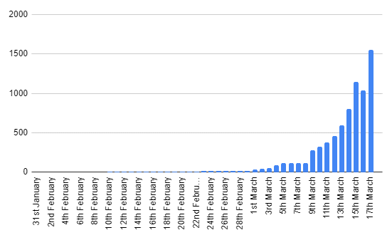
You can't see it, but the values for the first 9 days are just two people.

Though see how there's a dip on March 16th? How could there possibly be a dip in cases for one day by over 100 people? It seems even the pros can get their numbers wrong. Bad work, WHO. 🙁

Also, you'll notice from around March 5th to March 8th, it goes flat. These are days on which I didn't check the figures.

From these total cases per day, I've calculated new cases per day.

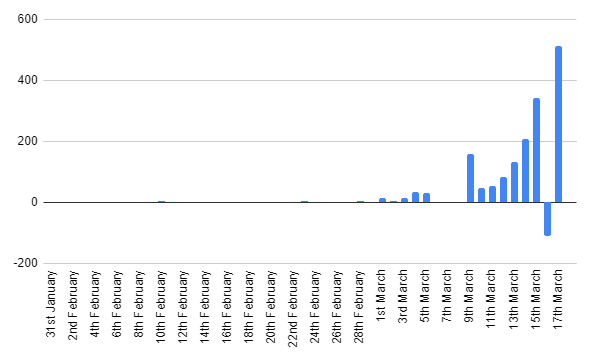
See that negative number of new cases on March 16th? Insert eyeroll emoji.

There's also a spike on March 9th, this is just total new cases from March 5th to March 9th. -catching up from when I didn't check on the totals on these days.

But as you can see, as predicted, this initial growth is basically exponential. Fairly typical for an epidemic apparently.

So the big question is... what next?! -and here's where my mathematics and statistics study comes in handy... I've recently finished a section on epidemics! What better time to apply some of my learning!

First off, it's worth mentioning that all the epidemic modelling I've learned about assumes homogeneous mixing. This is the kind of mixing that occurs in a family home. ie: there's more or less an equal chance of me having contact with one person than there is anyone else. In real life this, of course, isn't true. Living in London, I'm less likely to be in contact with someone in Edinburgh than I am someone I travel with on the London Underground every day. Also important point: homogeneous mixing means no quarantining. So all of the below is essentially average worst-case.

So with the proviso that these results will probably (more than likely) be wildly inaccurate, let's get started! We need a few important numbers, some of which we've already got:

  1. We need the starting number of infected (y0), in this case 2.
  2. We need the starting number of non-infected (x0), that's the total population of the UK minus 2. I decided to estimate the current population at 67.44 million.
  3. We need the epidemic number, ρ. This is calculated in the following way:

\rho =\frac{n\gamma}{\beta}

Where:

  • n is the total population (67.44 mil).
  • γ is the parameter in the exponential distribution that describes the mean recovery time of the virus. (It's random).
  • β is the parameter in the Poisson distribution that describes the mean contact rate (per day). (Also random).

Which is fine, but how do we know what γ and β are? Well there's a number called R0 ("R-naught") that I've NOT been taught about that represents the contagiousness of a virus. Interestingly, I've found two completely opposed descriptions of this number:

  1. https://en.wikipedia.org/wiki/Basic_reproduction_number
  2. https://towardsdatascience.com/social-distancing-to-slow-the-coronavirus-768292f04296

Though we all know how reliable wikipedia is, and I've just found this Stanford paper which supports the towardsdatascience description:

R_{0}=\frac{\beta}{\gamma}

Therefore:

\rho =\frac{n}{R_{0}}

Hooray. Imperial College London seems to estimate the R0 of COVID-19 to be 2.4, so let's run with that.

\rho =\frac{67440000}{2.4}=28,100,000

Max Number Of Infectives At One Time

Once we have all this, we can work out the maximum number of infectives at any one time. ie: the peak of the infection in the population, ymax:

y_{\text{max}} = y_{0} + x_{0} -\rho -\rho\:\text{log}\left(\frac{x_{0}}{\rho}\right)

Now we can plug all the numbers in to find ymax! So:

y_{\text{max}} = 2 + 67439998 -28100000 -28100000\times\:\text{log}\left(\frac{67439998 }{28100000 }\right)

Hence:

y_{\text{max}} = 28,656,065

Which is 42.5% of the population infected at one time! Ouch! At least you'll know that if we (in our theoretical UK) hit 28 million with no quarantining, we'd be at the peak of the outbreak.

Other sources state that COVID-19 actually has a range of R0 values, 1.4-3.8-ish, so the band of possible outcomes without quarantining is actually quite broad. But from this it's possible to work out a best-case/worse-case comparison:

An R0 of 1.4 would mean a max of 12.2 million (18% of the population), and an R0 of 3.8 would mean a max of 39.4 million (58% of the population) at one time.


Number Of People Not Affected

The following assumes that the whole debacle is over. Everyone that has caught the virus from it has now recovered. How many people were not affected?

This is found using the following iteration formula:

x_{\infty,j+1}=x_{0}\:\text{exp}\:\left(\frac{x_{\infty,j}-\left(x_{0}+y_{0}\right)}{\rho}\right),\:\:\: j=0,1,2,\:\ldots

Initially x_{inf,j} is zero, and you use your result x_{inf,j+1} to calculate x_{inf,j+2}, and so on. This eventually settles down to the number of people not affected!

So using the power of spreadsheets, and not taking up the space here with columns and columns of numbers:

  • R0 of 1.4 would mean 32.98 million people are not affected.
  • R0 of 2.4 would mean 8.29 million people are not affected.
  • R0 of 3.8 would mean 1.66 million people are not affected.

You can imagine that an increase in quarantining means a lower R0. Seems that could have a big effect.

#ImNotAStatisticianButItsStillFunLookingAtNumbers